Foglight eDocs Information Architecture
This was a project to design, build, update, and manage a content-heavy web site to provide product documentation to customers. The design goal was to make the content easy to search and navigate. The starting content consisted of a large quantity of PDF and HTML documents.
When I joined the team, I realized that the project did not have full buy-in from senior management. So I started by designing and producing an internal prototype site using freely available web components. After launching the site I evangelized the site internally, keeping it updated and blogging about it. Internal stakeholders were soon on board, and we had the go-ahead to produce the real site, and also some valuable feedback for improvements.
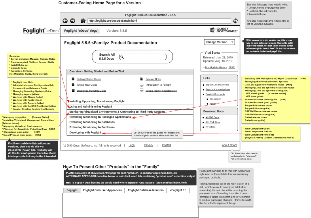
The full site was then designed and built, using Agile methods to continually iterate and control the scope of the effort. I created wireframes using Balsamiq, and produced design videos for senior management.
The main information architecture challenge was how to present the content so that it would be easier to navigate and use. The solution was to provide a “landing page” for each product release, which organized the content in a task-oriented manner, rather than by functionality. The jQuery UI accordion component was used to make the group contents easier to scan and digest. We also decided to implement a Google-based search solution, because we found users often wanted to simply search for information. Other features were implemented including a mechanism for switching between versions and for subscribing to site updates.
The site was designed to be built quickly using off-the-shelf web components and existing in-house tools. It was also designed to be scalable, so that new product releases and related products could be added quickly and easily.
Tools: Notepad++, Balsamiq, Visio, PowerPoint, SVN, Jira, Microsoft Expression Studio

